Color Pschyology
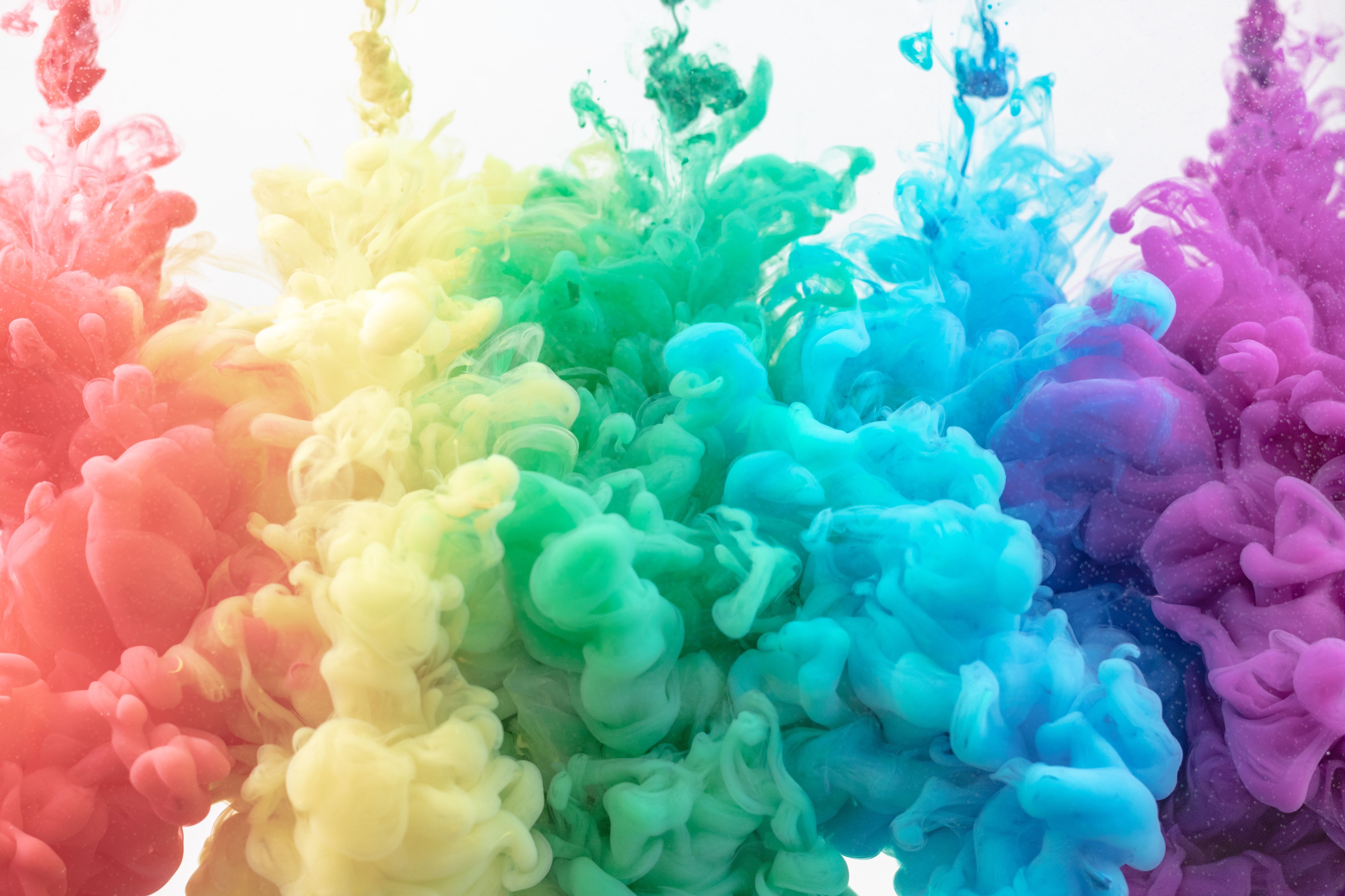
You may easily make your home more pleasant by employing the psychology of interior design. Colors, arrangement, and textiles can all be simply changed to improve your mood and inspire happy sensations. Color mixing is an art form. We employ the 60/30/10 guideline in design, which states that our room should be 60% one color, 30% another hue, and 10% accent color. (This formula can also be used for events and arranging the table.) The right color is essential for setting the tone and purpose of a room. Lighter colors, like the sky, tend to feel more open and light, whereas darker colors give off a heavy vibe and can make you feel more enclosed. The more white that is added to a color, the more light it can reflect, whereas darker colors absorb light. The basic color wheel, which contains 12 colors, serves as the foundation for color theory. These are divided into primary, secondary, and tertiary colors, which, when mixed with a neutral (black or white) to modify the tones, form an entire spectrum of colors that encompasses everything you can think of.
-
Primary - Can’t be made from mixing other colours - Red, blue, yellow.
-
Secondary - be made by mixing primaries - Green, orange, purple.
-
Tertiaries - Can be made by mixing primary and secondaries - teal (blue-green), amber (yellow-orange), and berry hues (red-purple) to name a few.
-
Red:- Red, the most vivid color, increases the energy level in a room and stimulates the adrenal glands. Red is associated with ambition, action, and willpower, which is why it's a wonderful choice for home offices and creative areas. Red attracts people together and fosters conversation in the living room or dining area. It makes a great first impression in an entry hall.
- BLUE:- Blue is one of the most powerful colors in the color psychology spectrum, and it is thought to lower blood pressure and reduce breathing and heart rate. Deep, bold colors inspire confidence and are associated with qualities such as loyalty, trust, peace, and success. This color is generally advised for bedrooms and bathrooms where you want to create a pleasant ambiance because it is considered calming and quiet.
- YELLOW:- Yellow promotes happiness by capturing the warmth of the sun. It's a terrific choice for energizing and welcoming kitchens, dining rooms, and bathrooms. To generate a sense of light and space, stick with golden tones and use them to brighten gloomy regions of your home.

 Lucky Interior Decor